
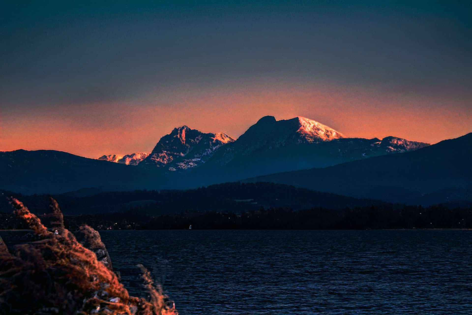
The day to night Photoshop transformation is one of those techniques that looks difficult but follows a clear, learnable logic once you understand what actually changes when the sun goes down. Light sources invert – instead of broad, even daylight, you get isolated pools of artificial light surrounded by deep shadow.
In this tutorial, you will learn 2 methods to do this – one using AI, one manual using adjustment layers.
The technique is highly valuable for real estate and architectural photography (showing how a property looks at night), film and video thumbnail creation, game concept art, and social media content where a dramatic mood change is needed quickly.
Note: this tutorial is updated in March 2026, and is Photoshop 2025 compatible. The technique works on any landscape or cityscape photo.
| Difficulty | Beginner (Method 1) · Intermediate (Method 2) |
| Time Required | Method 1: 2–5 minutes · Method 2: 20–35 minutes |
| Software | Adobe Photoshop CC 2020 or later. Method 1 requires 2024+ for Landscape Mixer Neural Filter. |
| Best For | Landscapes, cityscapes, architecture. Method 2 also works well on portraits. |
| Key Techniques | Neural Filters, Curves, Hue/Saturation, Color Balance, Gradient Fill, Blend Modes, Layer Masks |
| Photo Required | Any well-exposed daytime photo — best results with blue sky and/or artificial light sources visible |
Choosing the Right Photo: What Works and What Doesn’t
Both methods work best with photos that have certain characteristics. Choosing the right source image is the single biggest factor in the quality of your final result.
Photos that convert well:
- Cityscapes and skylines: Buildings already have windows that read as lit at night. Street lamps, signs, and traffic infrastructure give you natural anchor points for artificial light sources.
- Blue hour or golden hour shots: Photos taken just after sunset have directional side-lighting that closely mimics night lighting – the conversion requires far less correction.
- Overcast or hazy sky: A bright blue sky is the hardest element to make convincingly ‘night’. A white or grey sky converts to a dark night sky much more easily.
- Landscapes with water: Water reflects available light and adds natural luminosity to night scenes, making the result feel more atmospheric.
Photos that are harder to convert:
- Harsh midday sun: Strong overhead shadows baked into the photo fight against the ‘night’ treatment. The shadow directions are wrong for a night scene.
- Portraits with people: Skin tones under the AI method in particular can look unnatural. Method 2 (manual) gives you enough control to handle portraits, but it requires additional steps.
- Very bright, blown-out skies: A completely white/overexposed sky has no detail to work with. You’ll likely need to replace the sky entirely for best results.
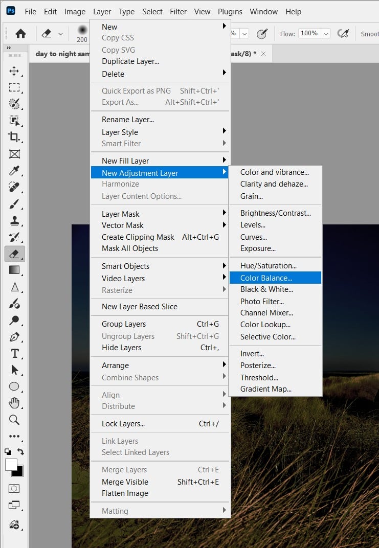
METHOD 1: THE AI FAST METHOD — LANDSCAPE MIXER NEURAL FILTER
Best for: quick results, social media, beginners, low-stakes projects where speed matters more than fine control.
Step 1: Open Your Photo and Duplicate the Layer
File → Open your image. In the Layers panel, press Ctrl+J (Cmd+J on Mac) to duplicate the Background layer. Rename it “Day to Night” – always work non-destructively!
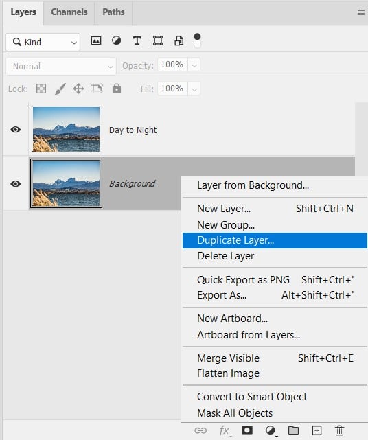
Optional – Step 2: Convert to Smart Object
Right-click the “Day to Night” layer and choose Convert to Smart Object. The layer thumbnail gets a small badge icon in the corner.
This step is optional but strongly recommended. When you apply the Neural Filter to a Smart Object, it becomes a Smart Filter – meaning you can double-click it at any time to re-open the filter and change the settings. Without this step, the filter is baked in permanently.
Step 3: Launch the Landscape Mixer Neural Filter
Go to Filter → Neural Filters → Landscape Mixer (under the “Beta” or main section depending on version). The Neural Filters panel opens on the right side of the screen. Scroll down through the filter list – Landscape Mixer is typically in the ‘Beta’ section or just below the main filters depending on your Photoshop version.
If you see a download icon next to Landscape Mixer, click it to download the AI model first (requires an internet connection). This is a one-time download of around 100 – 300MB depending on your version.
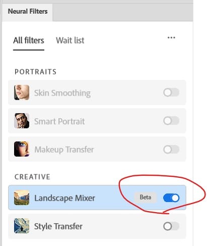
⚠ Watch Out: Neural Filters require an active Adobe Creative Cloud subscription and an internet connection for the initial model download. The filter itself runs locally on your machine after download, so it works offline once installed.
Step 4: Adjust the “Night” Slider
Once Landscape Mixer is open, you’ll see a row of preset thumbnails at the top (Spring, Summer, Autumn, Winter, Snowy, Night, Sunset, Stormy, and more). Click the Night preset to select it.
Adjust the “Night” slider until you are happy with the result:
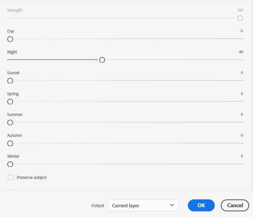
💡 Pro Tip: Try the Sunset preset alongside Night — it often produces a dramatic dusk result that can look more natural than the full Night transform, especially on shots with complex foreground elements. You can lower opacity on the Night layer and blend it with a Sunset layer underneath for a ‘blue hour’ look.
Step 5: Apply and Compare
Click OK to apply. Back in the main workspace, toggle the “Day to Night” layer visibility to reveal the jaw-dropping transformation.
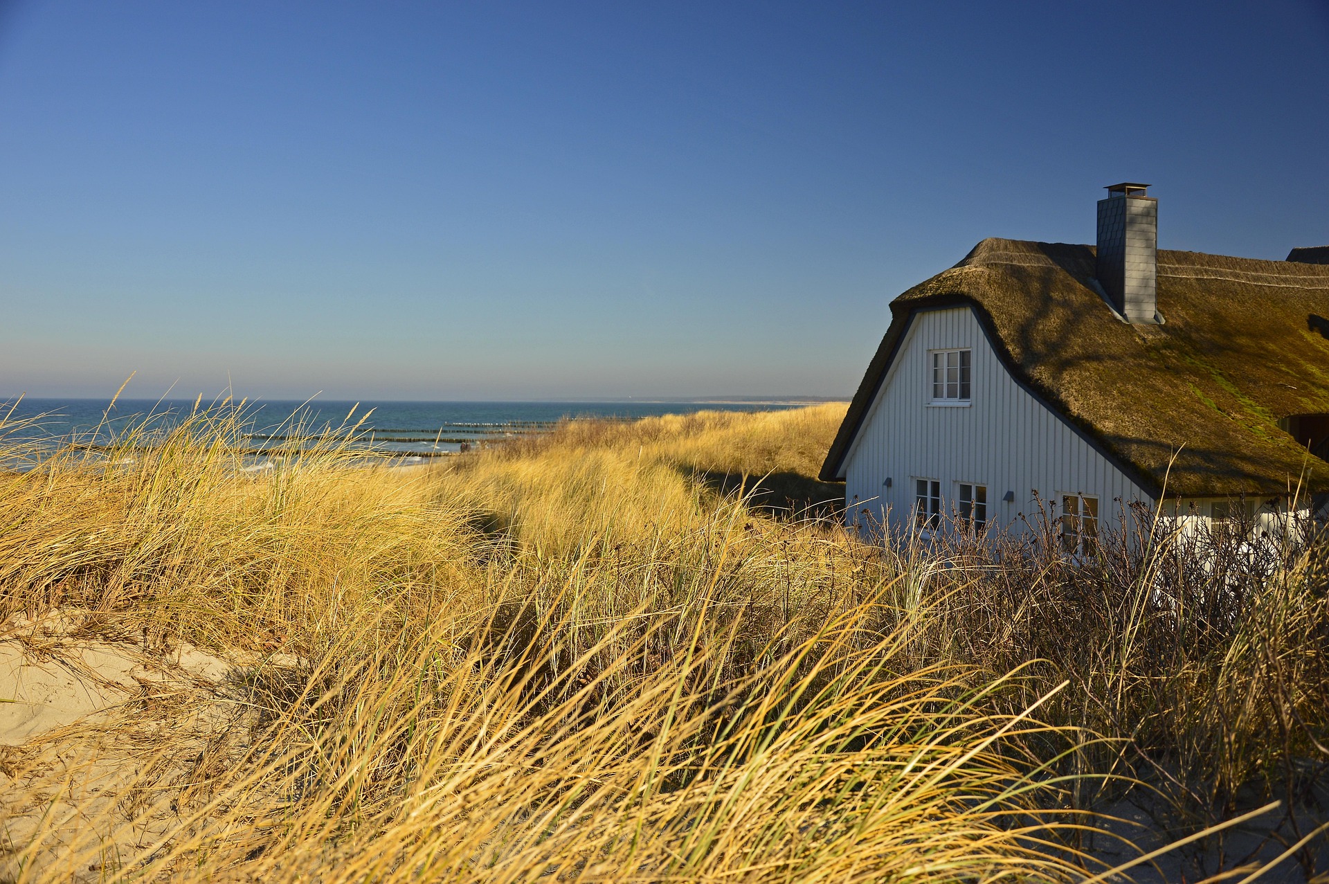
Before
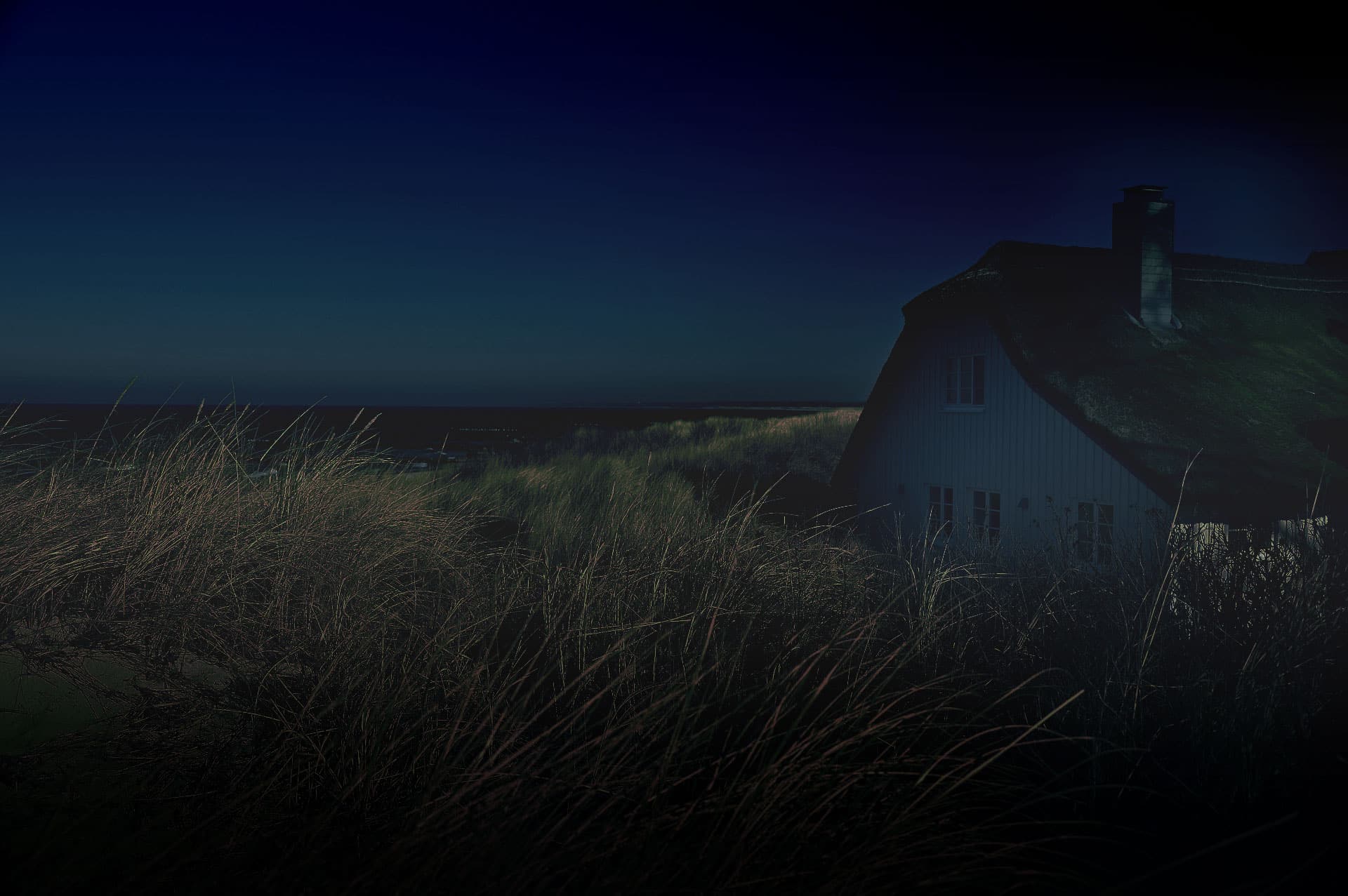
After
Pros & Cons of the Landscape Mixer Method (Photoshop Day to Night)
| Pros | Cons |
|---|---|
| Lightning-fast – literally seconds | AI sometimes adds unrealistic elements (e.g. random moons or stars) |
| Zero masking or manual painting required | Less control over exact lighting direction compared to full manual |
| Perfect for beginners and social media | Can over-darken or lose subtle details in very complex scenes |
| Non-destructive (Smart Filter) | Occasional colour casts (too blue or magenta) |
| One-click city lights & star fields | Not ideal for portraits with people (faces can look odd at night) |
Optional Step 6: Refine with a Colour Lookup Layer
The Landscape Mixer result often has a slight colour cast that doesn’t quite match cinematic night photography — usually a bit too blue or a touch too magenta. A Color Lookup adjustment layer fixes this in seconds.
Add a Colour Lookup adjustment layer above the Night layer (Layer → New Adjustment Layer → Colour Lookup). In the 3DLUT File dropdown, try these presets at 20–40% opacity:
- NightFromDay.3DL — Specifically designed for this conversion. Adds a cooler, more urban night tone.
- Moonlight.3DL — Adds a bluer, more natural moonlit quality. Best for landscape/rural scenes.
- TealOrangePlusContrast.3DL — Gives a cinematic colour grade with warm artificial light vs cool shadows — the classic film look for night scenes.
Reduce the Colour Lookup layer’s opacity until the effect feels natural rather than applied — usually 25–40% is the sweet spot. You’re not trying to recolour the image dramatically, just unify the palette.
METHOD 2: THE MANUAL METHOD — FULL CREATIVE CONTROL
Best for: professional results, precise lighting control, portraits, real estate, animation frames, and any situation where Method 1 doesn’t give you what you need.
The manual method builds a night scene from the ground up using stacked adjustment layers. Each layer handles one specific aspect of the day-to-night conversion: overall darkening, colour temperature shift, shadow cooling, and finally, artificial light sources. Because every step is on a separate, editable layer, you can adjust any individual element at any time without affecting the others.
This method takes longer than the AI approach, but the results are consistently more convincing — especially for complex scenes — and you build up real, transferable Photoshop knowledge with every step.
| 🔍 Why this works: The manual method works because night lighting follows physical rules that adjustment layers replicate directly. Curves darken exposure. Hue/Saturation desaturates and shifts warmth. Color Balance cools shadows. Gradient fills create the sky-to-ground light gradient. And paint layers simulate artificial light sources. Each tool maps to a real-world phenomenon — which is why, once you understand the logic, you can apply it to any photo. |
Step 1: Set Up Your Layer Stack
Open your photo. Duplicate the Background layer (Ctrl/Cmd+J) and name it ‘Original — DO NOT EDIT’. Lock it by clicking the lock icon in the Layers panel. This is your safety net.
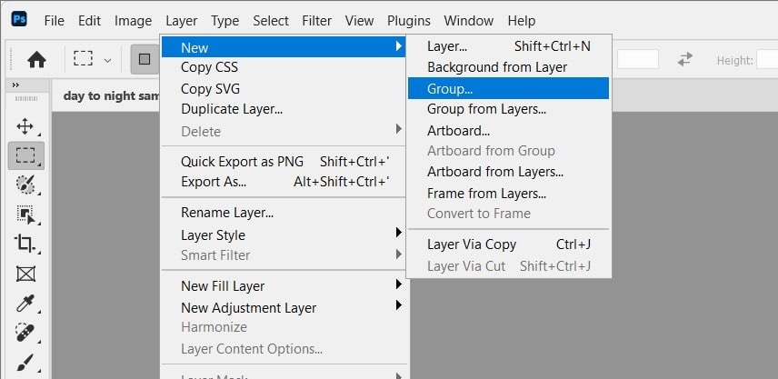
Create a new Group above it (Layer → New Group) and name it ‘Night Effect’. All the following adjustment layers will live inside this group. This lets you toggle the entire effect on/off with a single eye-click, and keeps the Layers panel organised.
| 💡 Pro Tip: Get into the habit of naming every layer and grouping related layers. When you come back to this file six months later — or hand it to a colleague — a well-organised layer stack saves enormous time. |
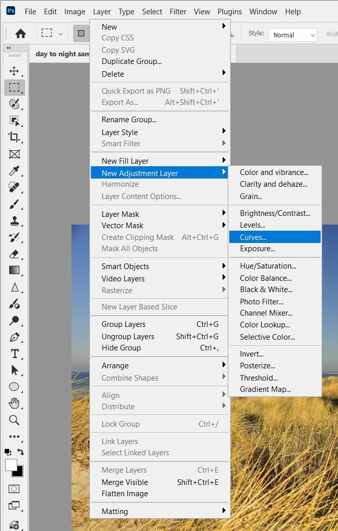
Step 2: Darken the Overall Exposure with Curves
Inside your ‘Night Effect’ group, add a Curves adjustment layer (Layer → New Adjustment Layer → Curves). This is the foundational darkening step.
In the Curves panel, click roughly in the middle of the diagonal line and drag it downward – you’re aiming for an overall exposure reduction of about 2 stops. The exact setting depends on your original photo, but as a starting point:
- Input: 128, Output: 50 (this darkens the midtones dramatically while preserving some highlight detail)
- Add a second point near the top of the curve: Input: 220, Output: 160 (this prevents the brightest highlights, like window light, from going completely dark — crucial for convincing artificial lighting)
- Leave the shadows (bottom-left) relatively untouched — they’ll be addressed by the Color Balance layer in the next steps
| ⚠ Watch Out: Don’t darken too aggressively in this single step. It’s tempting to drag the curve all the way down, but a photo that’s too uniformly dark looks wrong — real night scenes have extreme contrast between bright light sources and deep shadow. We build the darkness gradually across multiple layers. |
Now add a Layer Mask to this Curves layer. Using a large soft black brush at 20–30% Opacity, paint gently over any areas of the image that have existing light sources – building windows, street lamps, illuminated signs, headlights. We want these areas slightly less darkened than the sky and shadowed surfaces.
Step 3: Shift the Colour Temperature to Night
Daytime photos have warm colour temperatures (5500–6500K — full of yellows, ambers, greens). Night scenes are fundamentally cooler, with artificial lights being the only warm elements. This step strips the warmth from everything except the light sources.
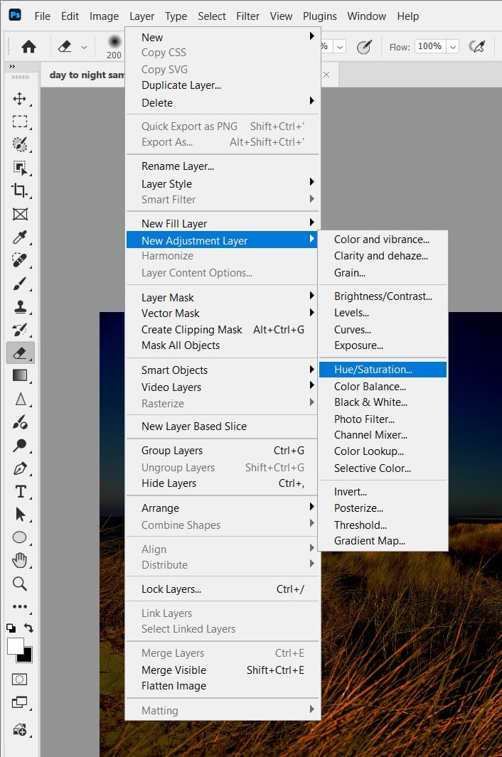
Hue/Saturation Adjustment Layer
Add a Hue/Saturation adjustment layer inside the group. Apply these settings:
- Master channel — Saturation: -35 (reduces overall colour saturation; night scenes are less vivid than day)
- Yellows channel — Hue: +15, Saturation: -50 (the yellows and greens of daytime foliage/stone shift cooler)
- Greens channel — Hue: +20, Saturation: -40 (shifts grass and trees away from vivid daytime green)
- Reds channel — Saturation: -20 (reduces warm brick/earth tones that read as too ‘day’)
| 🔍 Why this works: You’re not removing all colour — you’re selectively cooling specific channels that are ‘wrong’ for night. The goal is to make the scene feel like it’s lit by ambient sky light (blue-cool) and artificial sources (warm-amber) rather than the sun (warm and broad). |
Color Balance Adjustment Layer
Add a Color Balance adjustment layer. This is where the night colour character really develops. Work on each tonal range separately:
- Shadows: Cyan/Red: -20, Magenta/Green: 0, Yellow/Blue: +30 — shadows become cool and blue-shifted, like objects in moonlight or urban ambient sky glow
- Midtones: Cyan/Red: -10, Magenta/Green: -5, Yellow/Blue: +20 — midtones get a subtle blue-cool shift without going monochrome
- Highlights: Cyan/Red: +5, Magenta/Green: 0, Yellow/Blue: -10 — highlights stay slightly warm, preserving the feel of artificial light sources
| 💡 Pro Tip: The Shadow/Highlight split in Color Balance is doing the most important work here. In real night photography, shadows are always cooler (lit by blue sky ambient) while highlights are warmer (lit by artificial sources). Getting this separation right is what makes a manual night conversion look photographic rather than just ‘darkened’. |
Step 4: Replace or Darken the Sky
The sky is almost always the biggest problem in a day-to-night conversion. A bright blue or white daytime sky simply cannot look like night no matter how much you darken it – there’s too much retained colour information and the wrong quality of light.
Option A — Gradient Fill (fastest)
Add a Gradient Fill layer (Layer → New Fill Layer → Gradient). Configure it as follows:
- Gradient: Custom – from #0A0E1A (near-black dark blue) at 0% to #1A2A4A (dark navy) at 60% to #2A3A6A (slightly lighter navy) at 100%
- Style: Linear
- Angle: 90° (top to bottom – darkest at top of sky, slightly lighter toward the horizon)
- Scale: 150%
Add a Layer Mask to this gradient layer. Using a selection of the sky (Select → Sky works well in Photoshop 2021+, or use Select → Color Range), paint black on the mask over the foreground buildings, trees, and ground — leaving the gradient visible only in the sky area.
Option B — Sky Replacement (most realistic)
For a more photorealistic result, use Photoshop’s built-in Sky Replacement (Edit → Sky Replacement). This is available in Photoshop 2021 and later. Choose a dark, star-filled or cloudy night sky from the built-in library, or import your own. Sky Replacement automatically handles the horizon blending and colour-matches the sky to the foreground lighting — significantly more convincing than a plain gradient for complex skylines.
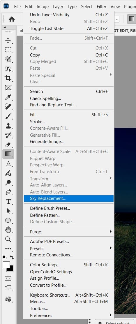
| ⚠ Watch Out: If using Sky Replacement, set the ‘Foreground Lighting’ slider carefully. Too high and it makes the ground look like it’s lit by the sky (unnatural). Too low and the sky and ground look disconnected. Usually 20–40% gives a believable ambient sky glow on the upper surfaces of buildings. |
Step 5: Add Artificial Light Sources
This is the step that elevates a ‘darkened photo’ into a convincing night scene. Real night images are defined by isolated light sources — street lamps, illuminated windows, car headlights, neon signs, shop fronts. Without these, your image will look like a day photo with a dark filter, not a night photo.
Window & Building Lights
Create a new empty layer above all adjustment layers — name it ‘Window Lights’. Set its blend mode to Linear Dodge (Add). This mode makes the layer additive — anything you paint glows and brightens the layers below without obscuring them.
Select a small soft brush (15–30px, 0% hardness). Set Opacity to 40%, Flow to 50%. Choose a warm amber-yellow colour (#FFD080). Paint individual dabs over windows that should appear lit from inside. Don’t paint every window — selective illumination is more realistic. Vary the brush size slightly between windows for natural variation.
For a warm glow spilling outward from lit windows, add a second pass with the same brush at 5% Opacity and a much larger size (80–120px), colour #FF9A30 — paint loosely over the same window areas to create a halo of warm light on the surrounding wall surface.
Street Lamps & Overhead Lights
On a new Linear Dodge layer named ‘Street Lamps’, use a medium soft brush (40–60px) with colour #FFEE99 (sodium vapour light — the slightly yellow-white of real street lamps) at 30% Opacity. Click once on each lamp position to place the core of the light, then use a larger brush at 5% Opacity to paint the cone of light spreading downward and onto the ground below each lamp.
Ambient Ground Glow
Real city streets at night collect light from all the surrounding sources and reflect it upward — pavements, road markings, puddles all glow with a mix of ambient colour. Create a new layer named ‘Ground Glow’, blend mode Overlay, Opacity 40%. With a very large soft brush (300–500px) at 10% Opacity, use colour #2A3A7A to paint along the ground plane — this adds a subtle cool reflection on horizontal surfaces that dramatically improves photographic believability.
| 💡 Pro Tip: The single most impactful thing you can do to improve a manual night conversion is to add a reflection layer for wet pavement. Create a new layer in Multiply mode, flip your adjusted city image vertically, position it at street level, reduce opacity to 20–30%, and mask it to only the road surface. Even dry-looking roads look more convincing with the barest hint of reflection. |
Step 6: Final Colour Grade & Contrast
The final step locks all the elements into a unified, cinematic image. These two layers go at the very top of the layer stack, above everything else, outside the Night Effect group.
Curves — Contrast & Depth
Add a final Curves adjustment layer. Rather than just darkening, we’re adding contrast shape:
- Pull the black point (bottom-left) slightly inward — Input: 15, Output: 0. This crushes the deepest shadows to pure black.
- Pull the white point (top-right) slightly inward — Input: 235, Output: 255. This lifts the brightest highlights, making light sources pop.
- The result is an S-curve that increases overall contrast — darker darks, brighter lights — exactly how cameras render night scenes.
Color Lookup — Cinematic Grade
Add a Color Lookup adjustment layer at the very top. Try these LUTs at 20–35% Opacity to find the right cinematic finish for your image:
- NightFromDay.3DL: The most literal interpretation — cool, desaturated, urban.
- TealOrangePlusContrast.3DL: The classic Hollywood blockbuster grade — warm artificial lights, teal shadows.
- Moonlight.3DL: Softer, more romantic night feel — works well for landscape and nature shots.
- FoggyNight.3DL (if installed): Adds atmospheric haze that improves depth perception in urban scenes.
| ⚠ Watch Out: Apply Color Lookup at low opacity — 20–35% maximum. At full opacity these LUTs are designed as starting points and will overpower your careful manual work. They should feel like a subtle tonal unification, not a dramatic recolour. |
Before
After
Method 1 vs Method 2 — Which Should You Use?
| Situation | Method 1 (AI) | Method 2 (Manual) |
| Quick social media post | ✓ Ideal | Overkill |
| Client presentation / professional work | Sometimes fine | ✓ Recommended |
| Portrait with a person | Often unnatural | ✓ Full control |
| Architecture / real estate | Decent starting point | ✓ More convincing |
| Need specific light source positions | Not possible | ✓ Full control |
| Learning Photoshop fundamentals | Limited learning | ✓ Builds real skills |
| Very complex scene with many elements | Can struggle | ✓ More reliable |
| Simple landscape, one-time use | ✓ Perfectly fine | More time than needed |
The honest answer: use both. Start with Method 1 to get a quick baseline and preview the scene in night mode. Then use Method 2 to refine, add specific light sources, and fix anything the AI got wrong. They complement each other — the AI handles the broad transformation, the manual method handles the details.
Troubleshooting – Common Problems & Fixes
‘Landscape Mixer has added a fake moon/stars that look obviously AI-generated’
Reduce the Sky slider in the Landscape Mixer settings to 30–40% – this pulls back the AI’s sky transformation while keeping the overall night tone. Alternatively, paint black over the sky on the Neural Filter’s built-in output mask to suppress the AI sky entirely, then manually add your own dark sky gradient or Sky Replacement result on top.
‘My manually converted image still looks like a dark daytime photo, not night’
This almost always comes down to two missing elements: (1) you haven’t added any artificial light sources — night scenes must have visible light sources, even subtle ones; without them, the brain reads the image as ‘dark day’ not ‘night’. Add the Linear Dodge window/lamp layers from Method 2 Step 5. (2) Your shadows aren’t blue enough — increase the Yellow/Blue slider in the Color Balance Shadows range, or add a Photo Filter adjustment layer with a Cooling Filter (82) at 25% Opacity.
‘The sky looks completely disconnected from the foreground’
The sky and ground need to share colour temperature for the image to read as unified. Add a Gradient Fill layer in Soft Light blend mode at 30% Opacity – gradient from the sky’s darkest blue down to transparent — covering the entire image. This bleeds a little of the sky colour into the upper parts of buildings and acts as ambient light fill, connecting sky and ground visually.
‘Building windows I painted as lit look flat and unconvincing’
Painted lights need two components to look real: the core bright light (the window itself) and the spill glow (light spreading onto surrounding surfaces). Make sure you’re using two brush passes – a small, brighter core pass and a large, very faint glow pass. Also try adding a very small Gaussian Blur (0.5–1px) to the window lights layer — real light sources are never perfectly sharp at the edges.
‘My Curves darkening makes the whole image look muddy/flat’
You’ve darkened too uniformly. Add a Layer Mask to your Curves layer and paint black at 20% Opacity over mid-tone areas like road surfaces and lower building walls – let those areas retain slightly more exposure. True night scenes have extreme contrast, so the darkening should be concentrated in the sky and upper areas, with the street level being relatively less darkened because it’s lit by all the surrounding sources.
Further Readings
Mastering Sky Replacement in Photoshop: A Comprehensive Guide