
In this tutorial, I will show you how to create a rusty text effect inspired by the video game “Sekiro: Shadows Die Twice“. I will start by creating the rusty text, and then I will add some additional elements to give it a more stylised look.
The PSD file of this tutorial is available via the PSD Vault VIP members area.
Here is a preview of the final effect I have for this tutorial: (click to enlarge)

PSD Vault VIP Membership
You can download the PSD File for this tutorial via the VIP Members Area for only $6.95/Month (or less)! You will not only get this PSD File, but also 300+ other PSD Files + Extra Goodies + Exclusive Photoshop tutorials there. Signup now and get exclusive!

OK Let’s get started!
To complete this tutorial, you will need the following stocks:
Step 1
Create a new document sized 1440px * 780px with black background. Use the font we downloaded at the beginning of the tutorial, type some texts over the canvas:

Apply the following layer styles to this text layer:
Bevel and Emboss

Stroke

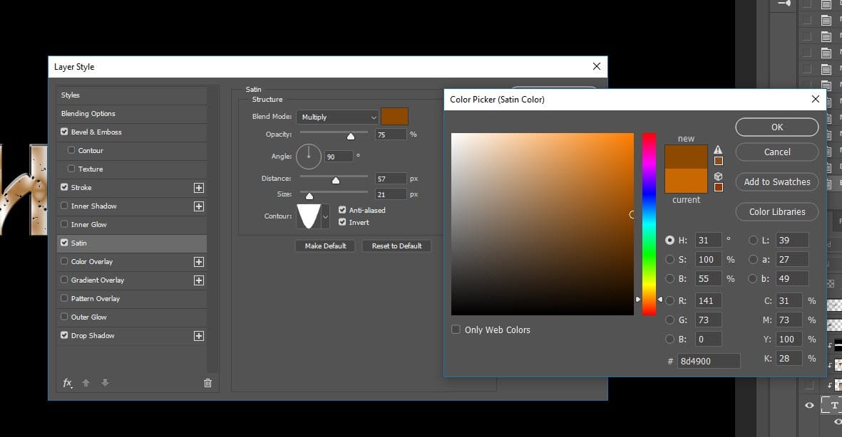
Satin (use a dark brown color and set blend mode to “Multiply”)
Drop Shadow

And this is the effect so far:

Step 2
Load the rusty metal stock image into Photoshop. Select the entire image:

Copy and paste the selection over to the text, and set this new layer as clipping mask to text layer below. Use the free transform tool to reduce its size:

Create new layer on top and use a soft black brush, paint some dark spots around the text. This adds some depth into the image:

Step 3
Load the fire stock image into Photoshop, select the fire particles using the lasso tool (set its feather value to 40px):

Copy and paste the selection to our document, reduce its size and place it over our text:

Duplicate this layer a few times, move them across and copy all the letters:

Step 4
I further applied some extra fire elements around the text:

I added an ancient sword onto the texts by using the following stock image:

Place the sword on the top left of the text:

I want to make the sword look like it’s spread the fire onto the text, so I picked this following section of fire and made a copy:

Attached this portion of fire onto the sword:

I painted some smoke effect around the text:

I applied some minor adjustments of colour and contrast, and this is the final result (click to enlarge):
That’s it for this tutorial! Leave me a comment below if you have any questions and I will try my best to answer it.