In this tutorial, you will learn how to make this 80’s Style Chrome Text Effect in Photoshop.
In the 80’s, sci-fi theme movies such as Tron and Back to The Future captured the unknown mystery and magic of computer technology.
At that moment, chrome design stood out as the people in that era were fascinated by those mythical futuristic idea. Hold on to your seat, we’re going to back to the 80’s and recreate that awesome chrome style. Fire up your Photoshop and start designing!
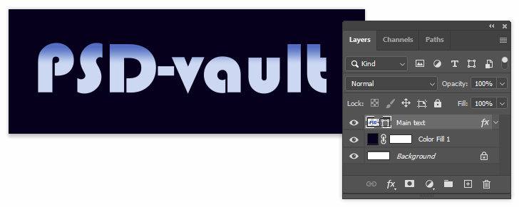
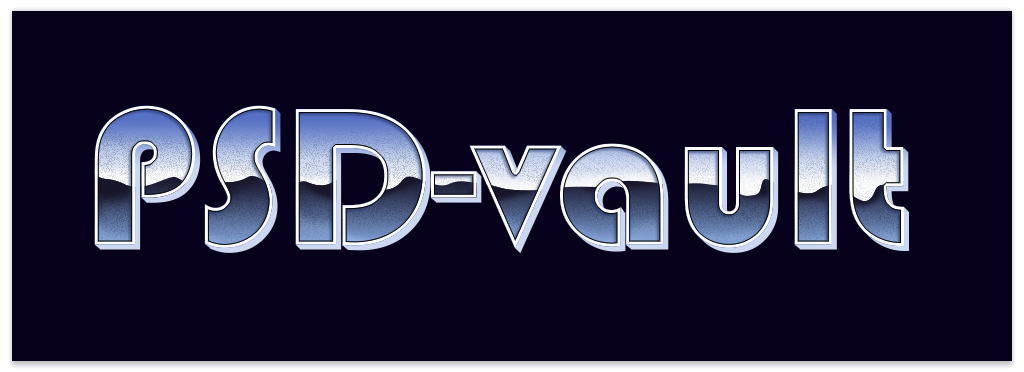
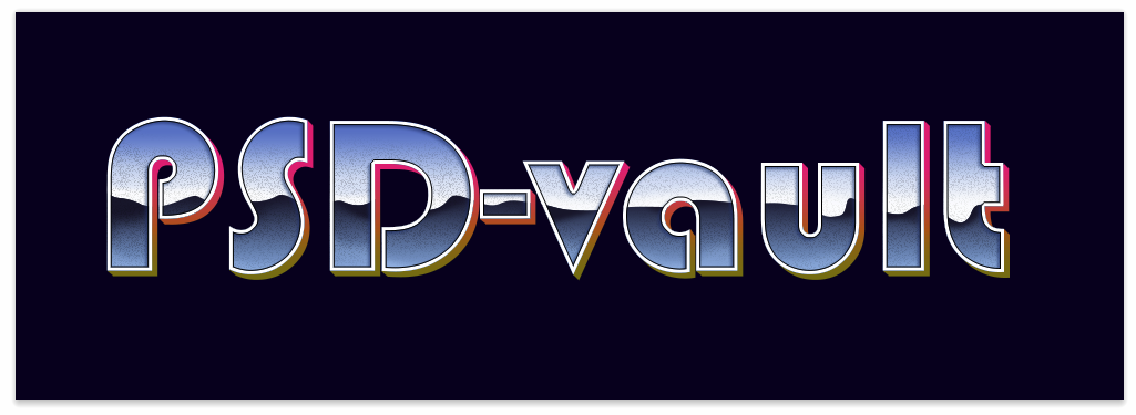
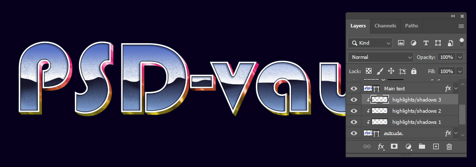
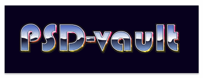
Preview
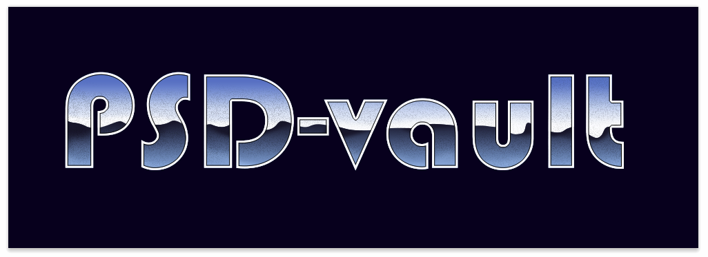
This is the text we’re going to make. Hope you like it.

Step 1: Preparation
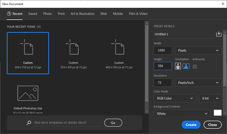
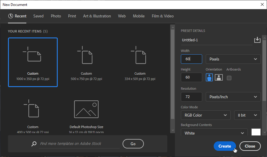
First, make a new document. Click File > New. The canvas size used here is 1,000 px × 350 px. You may need bigger canvas to fit more characters.
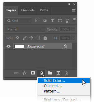
Step 2: Background
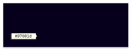
Add a Solid Color adjustment layer. Use very dark blue for its color.
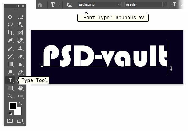
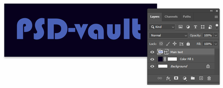
Step 3: Adding Text
Using Type Tool, add text onto the canvas. For the font type, I select Bauhaus 93 for its classic appearance. For the color, you can simply use any color. We will override it using Gradient Overlay in the next step.
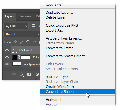
Step 4
Once you have settled with the text and font type, we want to convert it into layer shape. Remember that this step will remove its text and turn it into, well, shape. Only proceed to this step after the text is fixed and no further editing is needed.
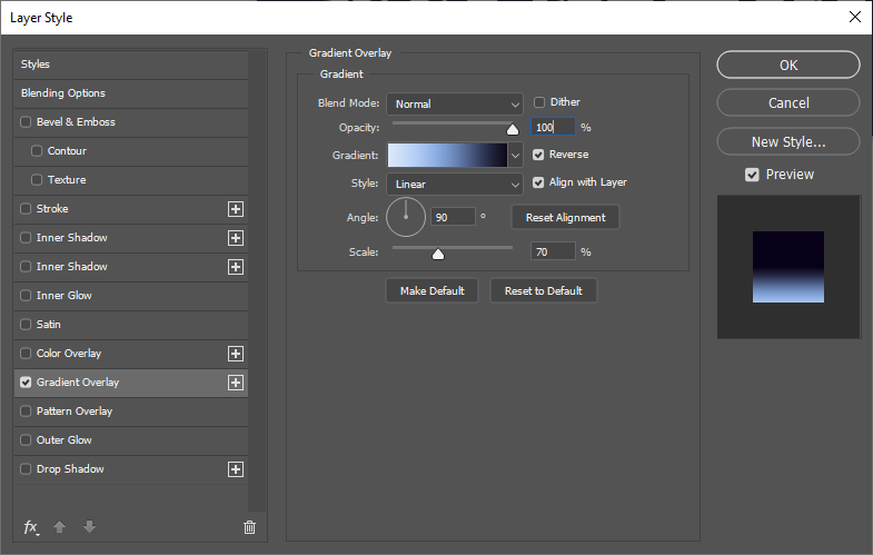
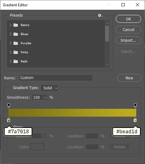
Step 5: Adding Gradient
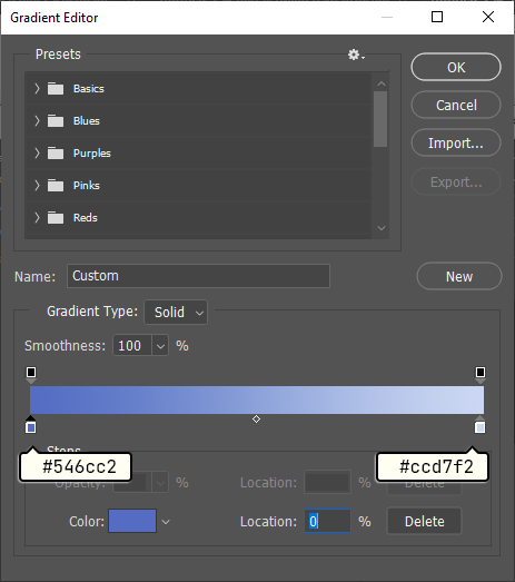
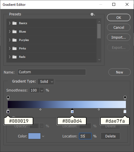
Double click the text to open up The Layer Style dialog box. Activate Gradient Overlay. For its color, use dark to lighter blue. Feel free to choose your own color.
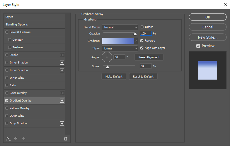
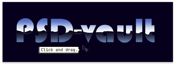
Step 6
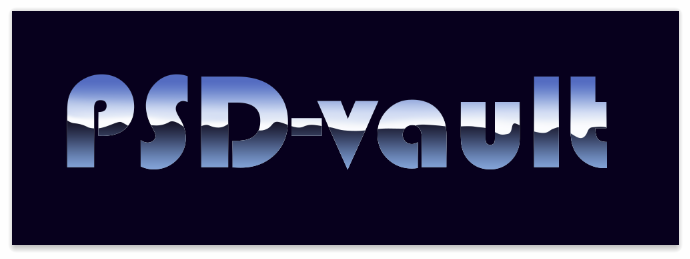
Hover cursor on top of the text without closing The Layer Style dialog box and then click and drag to move the gradient. This is what we want to have, darker color on top of the characters and lighter color at the bottom.
Step 7
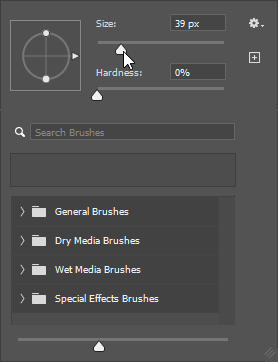
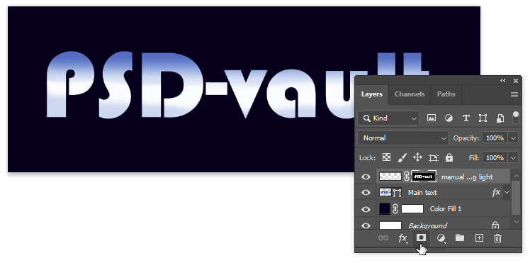
The color from the Gradient Overlay works great but just too artificial. The color changes gradually at the same pace on each character. I prefer it to be a bit random. We can combine it with manual drawing. Make a new layer and then activate The Brush Tool. Right click to set its brush size. Make sure to set The Hardness slider to 0%.
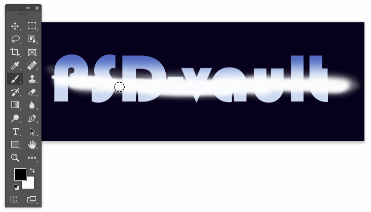
Step 8
On the new layer, paint a white line. Make it not so straight. A wacom would be convenient, but you can also use simple mouse. Just make to sure to drag along the line, not clicking and then Shift + clicking.
Step 9
Ctrl + click the main text’s thumbnail layer. We now have a selection in the shape of the text.
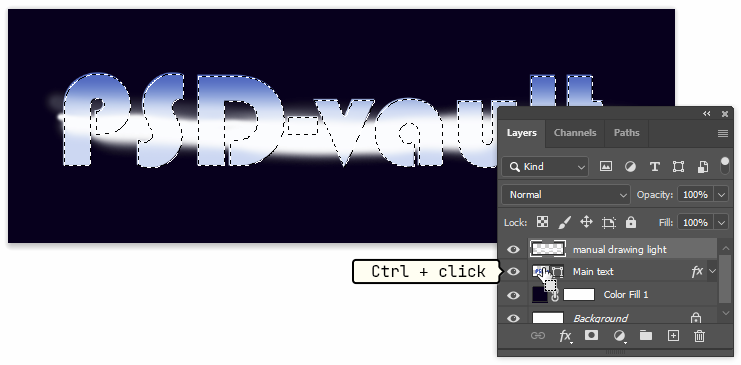
Step 10
Clik the Create a layer mask icon on lower part of the Layers panel. A layer mask appears and contains the white line inside the text.
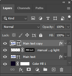
Step 11: Making Lower Part of The Text
Duplicate the main text layer by selecting it and then hit Ctrl + J. Place the new duplicated text layer on top of the other layers.
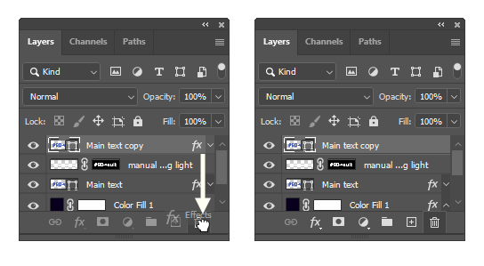
Step 12
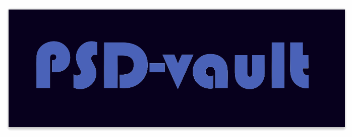
We don’t need its layer style. Click and drag The fx icon to The Recycle Bin icon to delete it. The main text now return to its basic appearance.
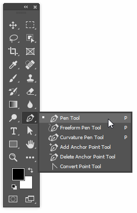
Step 13
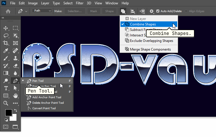
Activate The Pen Tool.
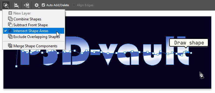
Step 18
Set its mode to Intersect Shape Areas. Click and drag to create a shape that divide the text into half.
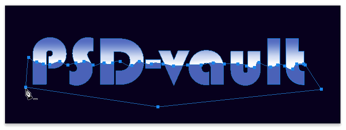
Step 19
We also want to add gradient to the layer shape. Double click the layer to open up the Layer Style dialog box. Activate the Gradient Overlay. The color should goes from dark blue to lighter blue.
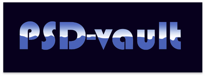
Step 20
Don’t close the Layer Style dialog box yet. Click and drag to reposition the gradient. Keep dragging until you find the perfect color combination inside the text.
Step 21
Just like the previous gradient, we don’t it to be too artificial. To make it flow naturally, we will alter it using manual painting. Add new layer. Activate The Eyedropper Tool and then click the darkest color to sample it.

Step 22
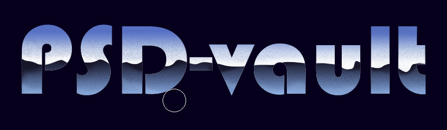
To paint inside the lower part of text we need selection to isolate the area. Ctrl + click the lower text thumbnail layer. Inside the selection, paint using The Brush Tool to darken certain parts of the area.

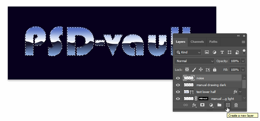
Step 23: Adding Noise
At this point, we’ve basically created the chrome look. But, we still want to improve it. If all you really want is a simple two dimentional text with chrome effect, you’re done. That’s it. But, we’re going to take it further by adding noise. Ctrl + click the thumbnail layer of the main text to make a selection based on the text shape. Add new layer and make sure to place it on top of all other layers.
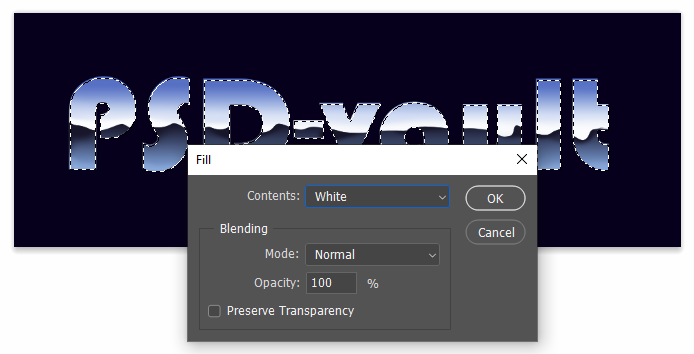
Step 24
Let’s fill the layer with white. Click Edit > Fill. Set its Contents to White.
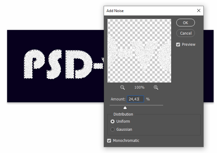
Step 25
Click Filter > Noise > Add Noise. Play around with the available settings. I personally prefer the Uniform distribution. It creates an evently distributed noise.
Step 26
Change the layer’s blend mode to Multiply and then reduce its Opacity. We don’t want to put noise all over the text. So, add a mask to the layer by clicking the Add layer mask icon.
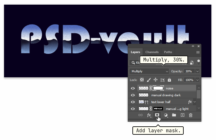
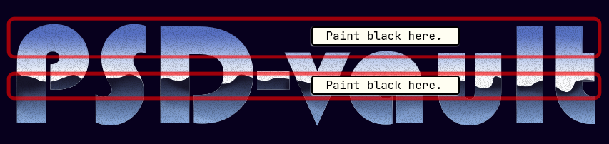
Step 27
Using The Brush Tool paint black on top and middle part of the text.
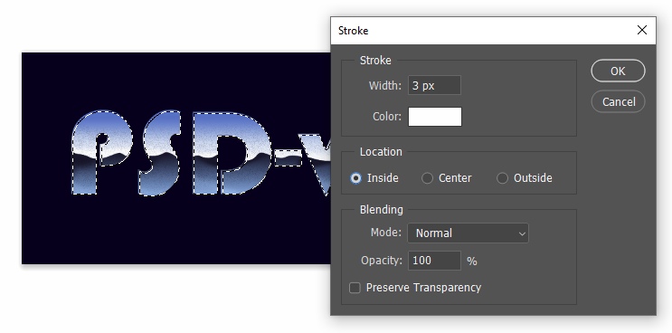
Step 28: Bevel
Let’s another effect to the text, bevel.Ctrl + click the main text layer to make a new selection based on the text shape. Click Edit > Stroke to stroke a line along the selection. Set the stroke Width to 3 px and use White as its Color
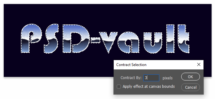
Step 29
Once again, Ctrl + click the main text layer to make a new selection based on the text shape. Click Select > Modify > Contract to subtract edges of the selection. Set Contract By: 3 pixels.
Step 30
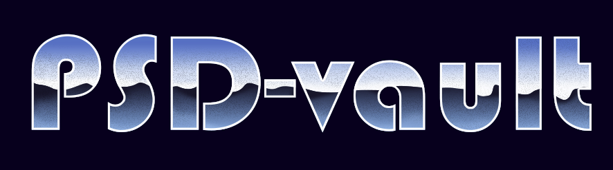
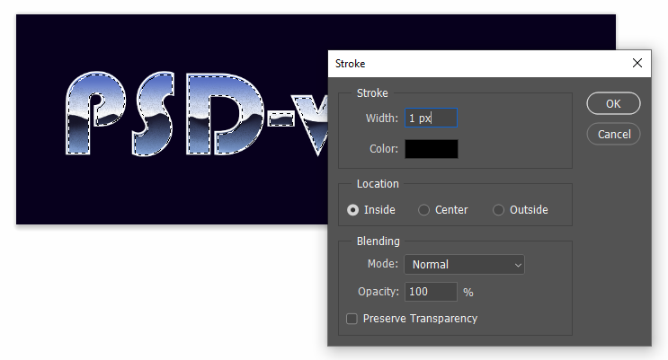
By contracting the selection 3 px, we are now selecting the inside of the previous stroke. Add another stroke to the selection from the menu Edit > Stroke. This time, set the Width to 1 px and use Black for the Color. Once the stroke command is applied, remove the selection using Ctrl + D.
Step 31
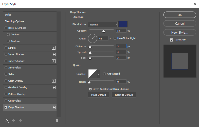
To turn the stroke into three dimentional shape we can just simply adding shadow underneath it. Double click the text stroke layer and activate Drop Shadow. Because the text is dominated by blue, I think a blue shadow is suitable. In the Layer Style options, select dark blue for the color. Use combination of Distance, Spread, and Size to determine the intensity of the shadow.
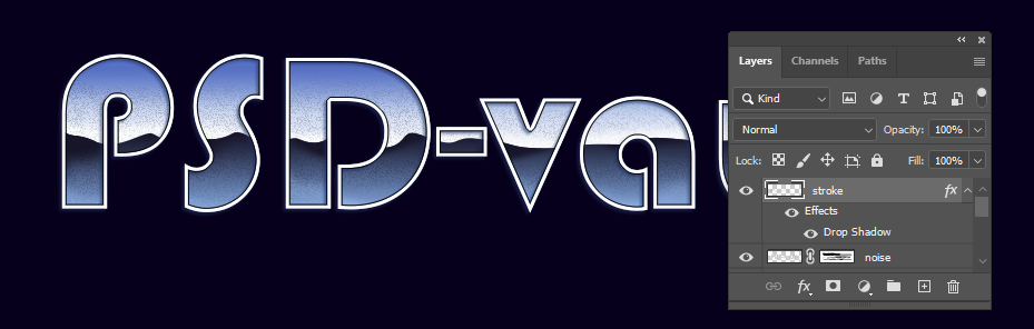
Step 32
If you change the background color to white, we can see the shadow behind the text. If you want it. That’s good. Congratulation! You can stop here. But, that’s not what we’re after in this tutorial. We don’t want to see shadow under current text.
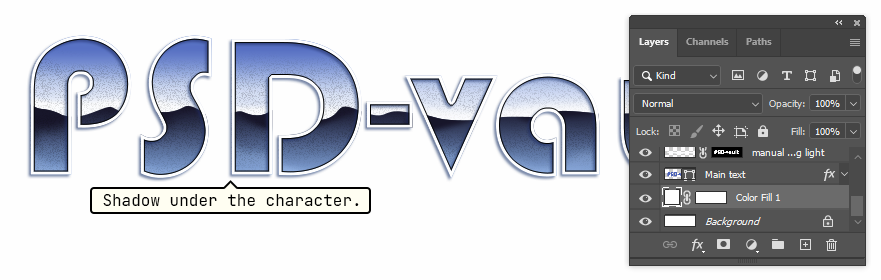
Step 33
Now, we are going to hide shadow outside the text. Ctrl + click the thumbnail layer of the main text. Click Add layer mask icon.
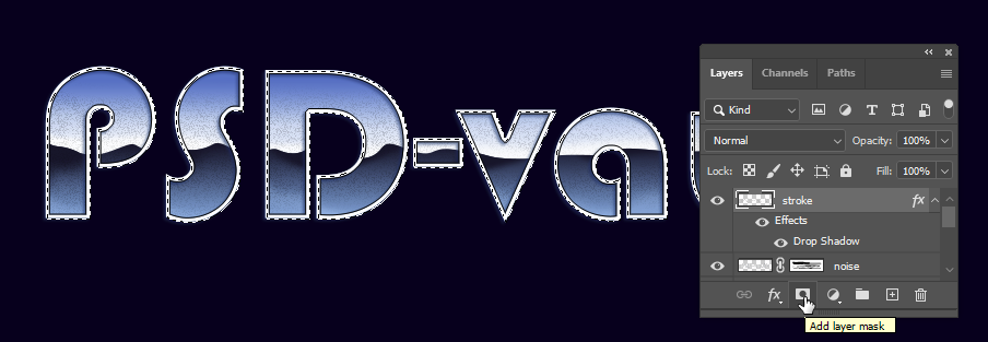
Step 34
If we change the background to lighter color, we still see the unwanted shadow. The addition of layer mask doesn’t seems to make a difference.
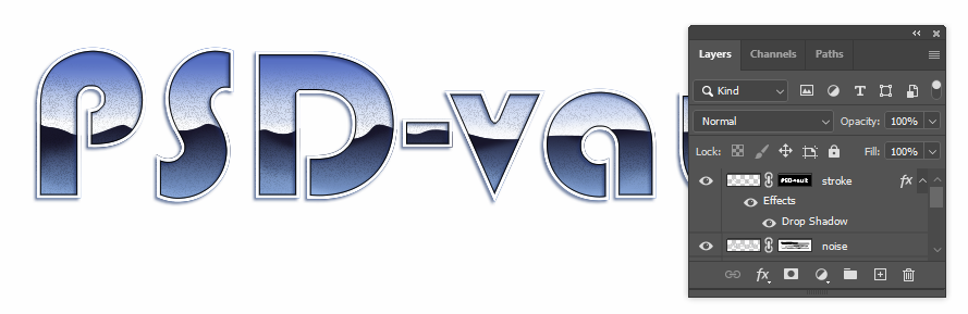
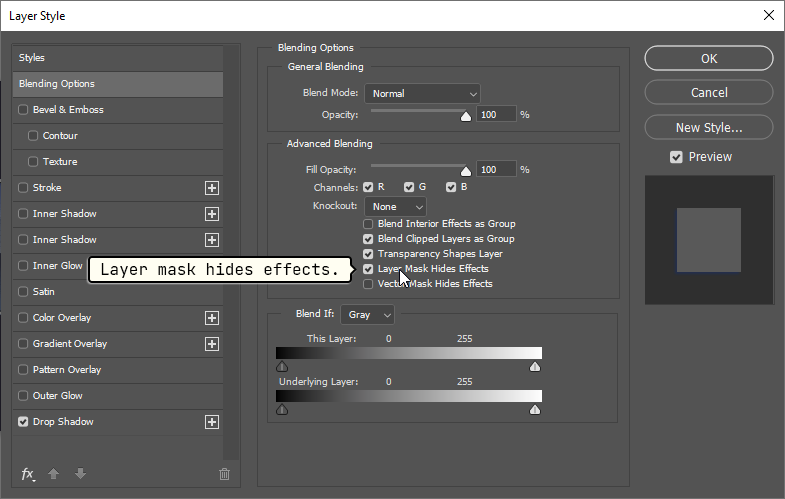
Step 35
By default, the layer mask doesn’t work on layer styles, only on pixels inside the layer. To change this behaviour, double click the layer to open the Layer Style dialog box. Activate Layer Mask Hides Effects.
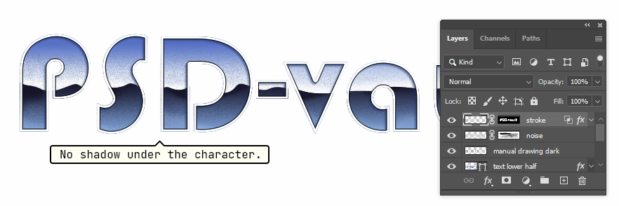
Step 36
Take a look at the result. Now, we have no shadow under the text. The only shadow we get is inside the text.
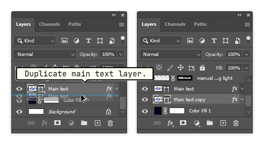
Step 37: Turn Text Into 3D Shape
The addition of Inner Shadow have embossed the text. Now, we’re going to add volume into the text. First, duplicate the main text layer and place it at the bottom, right above the background. You can Alt + drag the layer to duplicate it.
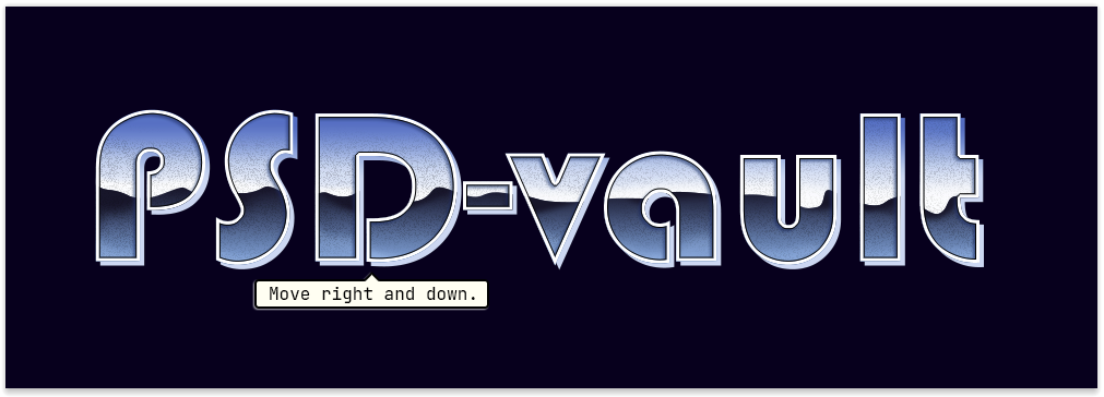
Step 38
Activate The Move Tool and hit the Down and Right arrows a few times to move it.
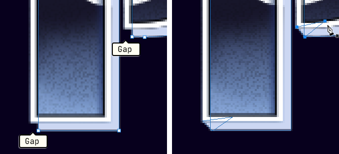
Step 39
We need to fix the gap between the original text and the new duplicate. Activate The Pen Tool and set its mode to Combine Shapes.
Step 40
This is the gap I talked about earlier. Using The Pen Tool, add simple shape to connect the corner of the text to its rear side.
Step 41
When you’re done, the result should be like this.
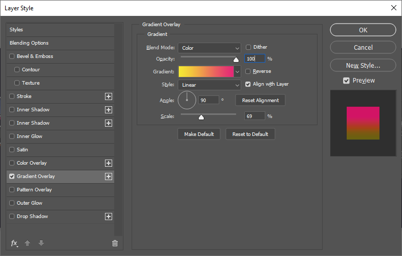
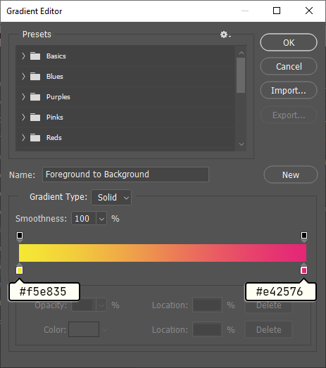
Step 42
Pretty cool, right? It will be a lot cooler if we use color that also suite the 80’s theme. Double click the text and add the following Gradient Overlay. The color gradient goes from yellow to red.
Step 43
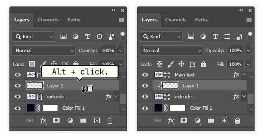
We need to add proper lighting to the text, by painting highlight and shadows, to improve the three dimentional effect. Add new layer right above the text volume. Place the cursor between both layers and then click while holding the Alt key.
Step 44
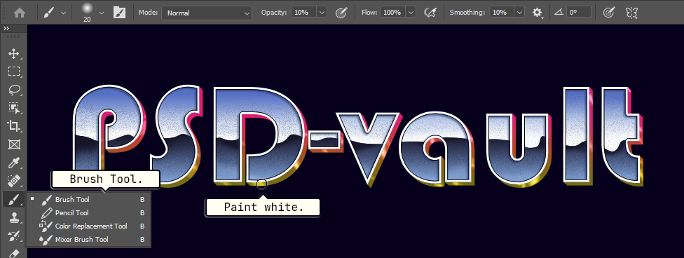
Using The Brush Tool paint white lines for highlight and black lines for shadow. Control the Opacity of the brush stroke using the number keys. Hit 1 for 10% Opacity, 4 and then 5 for 45%, or 0 for 100%. The thickness of the brush size can be controlled using the bracket ([ or ]) keys.
Step 45
You may need more than one layer to paint the highlights and shadows.
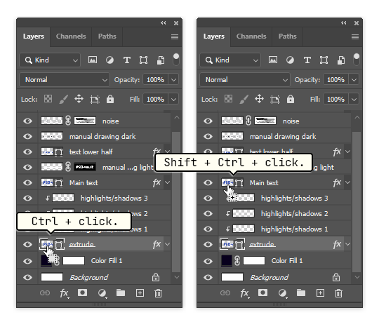
Step 46: Adding Outside Stroke
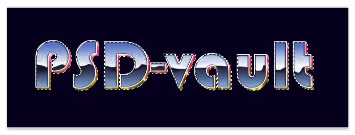
Hold Ctrl and then click the text volume thumbnail layer and then Shift + Ctrl + click the main text to select every part the text, both the front and its volume.
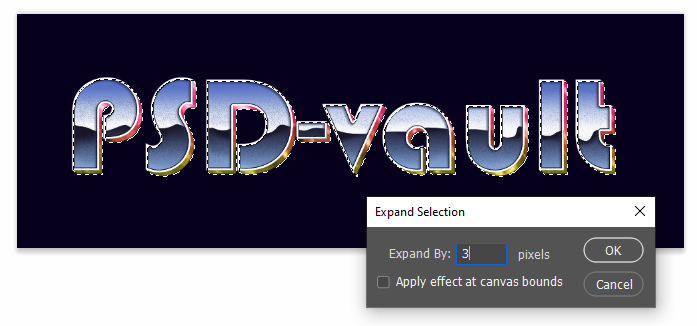
Step 47
Click Select > Modify > Expand to expand the selection. Set the parameter to 3 px. Hit the OK button. The selection edge will be expanded by 3 px, making it a bit bigger than the text itself.
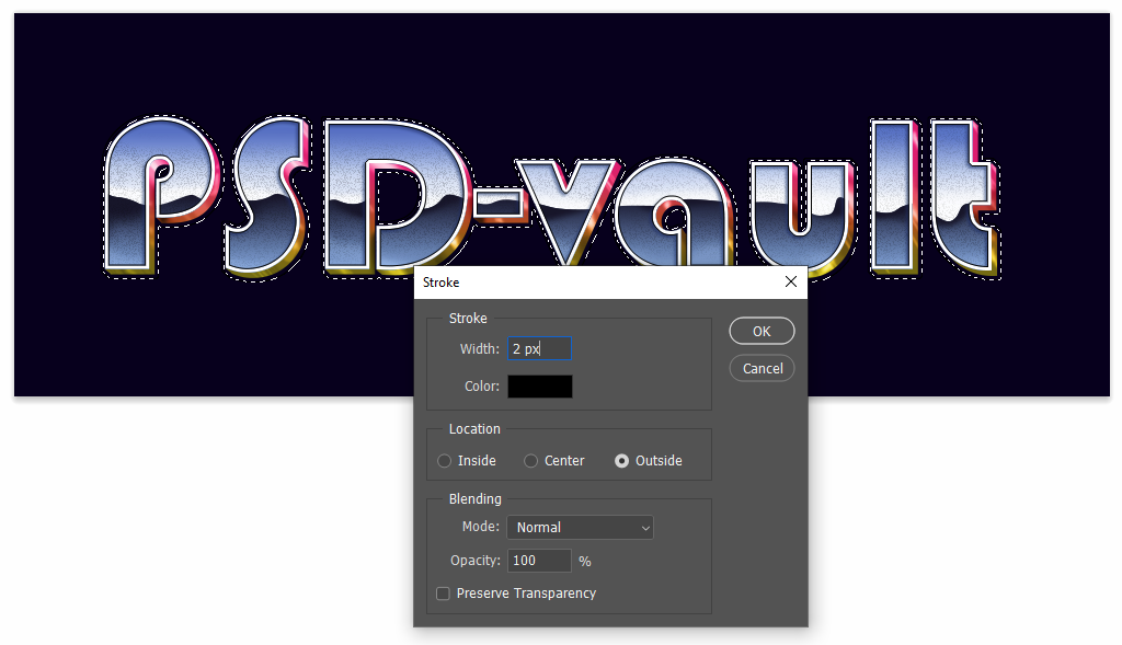
Step 48
Make a new layer and make sure it is placed above the text. Click Edit > Stroke. Set the Width to 2 px. Click OK to stroke a line along the selection. Make sure to use Outside as the Location of the line stroke, otherwise the line stroke created might touches or even covering the text.
Step 49
There are many options you can do with the new stroke line. One of them is adding Outer Glow.
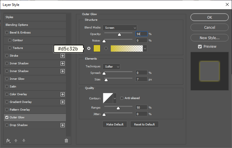

Step 50
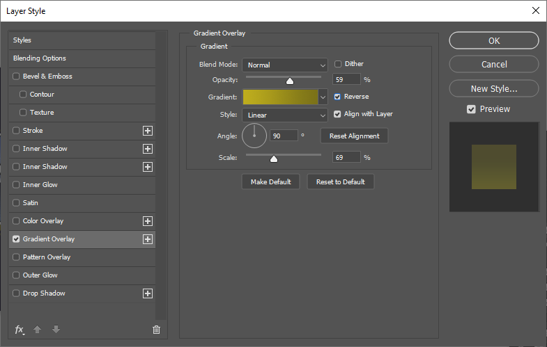
Another option is adding Gradient Overlay which is what I use here.
Step 51: Adding Light Sparks
We’re almost done here. But, I still want to add some light sparks to the text just to spice things up. We can directly make the light spark inside the text file, but for clarity we’re going to do it in a new file. Build a new file (Ctrl + N). We don’t need big canvas, 60 px × 60 px is adequate.
Step 52
Fill the canvas background with black. The light spark is going to be white or other lighter color. So, we definitely need black background. In a new layer, dab a soft white spot using The Brush Tool. Hit Ctrl + T and then scretch it into a thin and tall shape.
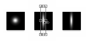
Step 53
Duplicate the layer (Ctrl + J) and then rotate it 90 degree. So far, we have a light spark in the shape of a plus sign.
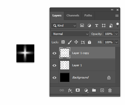
Step 54
The light spark is made of two layers. hit Ctrl + E to merge both layers. Duplicate it again by pressing Ctrl + J. Hit Ctrl + T to transform the layer. Rotate it 90 degree by dragging outside the transformation bounding box. Pull the handle into the center of the bounding box to decrease its size.
Step 55
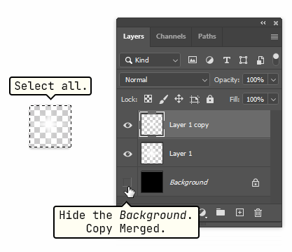
It looks pretty good to me. We’re going to export it into the text. Hide the black background layer. Select the canvas using Ctrl + A and then copy the selected area using Edit > Copy Merged.
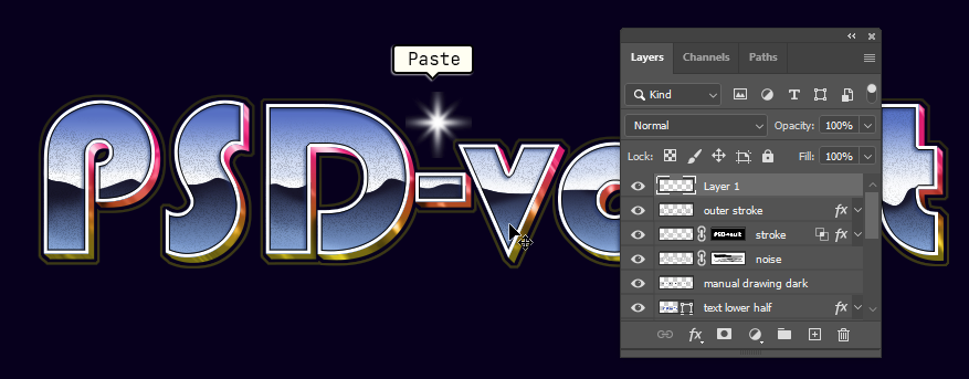
Step 56
Return to the text file. Paste the light spark, Ctrl + V.
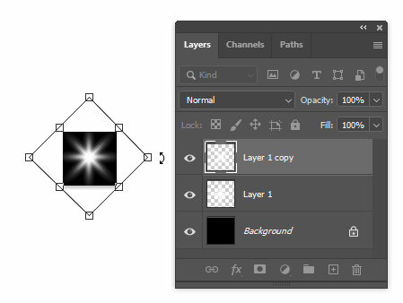
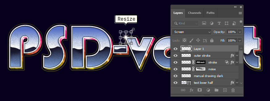
Step 57
The light spark might be too big. You can resize it using the transformation command, Ctrl + T.
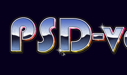
Step 58
Select the light spark and then Alt + drag to duplicate it. Add a few more light spark until you are satisfied with the result.
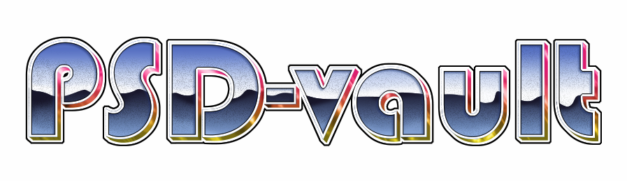
Final Result and Variations
Here’s what I get so far. Feel free to make another adjustment, either by adding adjustment layer or manual drawing. You can alter the color by adding Color Balance or Gradient Map. To enhance its contrast, apply Levels. You can also add texture to the characters. I hope you enjoy the tutorial. Thank you for reading.