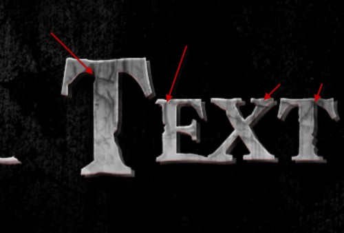
In this tutorial, I will show you the steps I took Design a Dirty, Cracked Text with Blood Effect in Photoshop. This is an intermediate level tutorial so some steps can be tricky, but why not have a try :)
The text effect tutorial is inspired by the Pirates of the Caribbean film typography – Personally I quite like this type of ancient, mystical typography, so I decided to replicate the text effect, plus some extra effect such as cracks and blood.
Here is a preview of the final effect I have for this tutorial: (click to enlarge)
PSD File Download
You can download the PSD File for this tutorial via the VIP Members Area for only $6.95/Month (or less)! You will not only get this PSD File, but also 70+ other PSD Files + Extra Goodies + Exclusive Photoshop tutorials there. Signup now and get exclusive :) Find out more about the VIP Members Areas
OK Let’s get started!
To complete this tutorial, you will need the following stocks:
Step 1
Let’s create a new document with black background (size doesn’t matter here) – load the concrete texture into Photoshop and select a portion of it as shown below:
Copy and paste the selection to our document, use a soft erase to remove some parts of the texture to create some depth to the image:

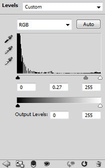
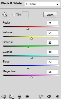
Add the following 2 image adjustment layers on top of this texture layer:
Black and white
Levels

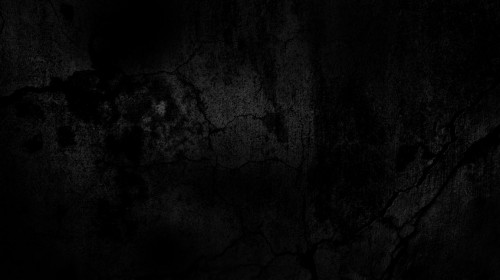
And you will have the following effect:
Step 2
Use the font we downloaded, type some texts onto the centre of the canvas:
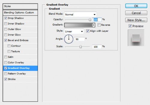
Apply the following layer blending options to this text layer:
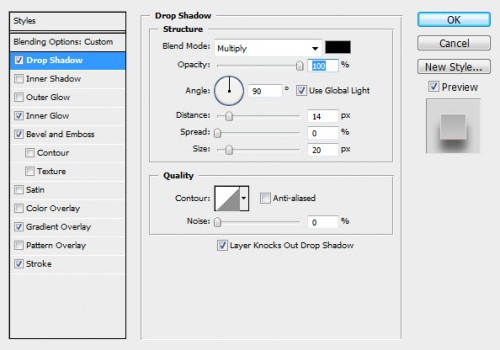
Bevel and Emboss

Gradient Overlay
Stroke

Reduce the layer opacity of this text layer to around 50%, and here is the effect so far:

Duplicate this text layer once and increase its layer opacity to 100%, move this duplicated layer slightly towards the top left, to create a fake 3D effect for the text:

Step 3
Now we can add some dirt texture onto the text. Load the selection of the text layer as shown below, then create a new layer on top of all previous layer, and use the dirt brush to paint some texture on this new layer:
If you’re having trouble with loading the text layer selection, check out this video tutorial below:
Here is the effect after painting the dirt texture:
Make sure you don’t over paint – a subtle effect will do:
We can also use the same method to add some crack texture onto the text as shown below:
As you add the crack texture, make sure you adjust the brush size to fit the text size for a better result:
and here is the effect so far:

Step 4
Now we can add some blood effect onto the text. To do this, you can again use the dirt brush with a dark red colour, paint some blood splash on a new layer:
We can also add some blood dripping effect with the following steps: Create a new layer and use a solid red brush to paint a single dot as shown below:
Use the liquify filter to warp this red dot and form a dripping effect:

Attach it to the text and use the free transform to adjust its shape if necessary:
Then change the layer blending mode of this blood dripping layer to “color burn”, and you will have the following effect:

Duplicate this blood drip layer a few times, scatter them around the text (resize them as you see fit) for more effect:

Step 5
Now let’s add some lighting effect on the text. Create a new layer on top of all previous layer and use a soft white brush to do a single click on the new layer:
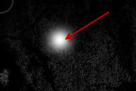
Then compress it down with free transform tool:

Duplicate this layer once and rotate it 90 degree clock-wise:

Merge those two layers together and attach it to the position shown below:

Step 6
We’re almost done! For some final touches, we can flatten the image and sharpen the text a little with the Smart Sharpen Filter, and use the Selective Color filter to apply some red blood colour on it:
Hint: Set this selective colour layer opacity to be around 50% for a subtle blood effect

Add the following Curves and Levels adjustment layer for adding some contrast and depth to the text:
Curves

Levels
Layer mask on the levels adjustment layer:
As you can see, now the text will have more contrast and the blood looks more realistic:
and here is my final effect for this tutorial: (click to enlarge)
That’s it for this tutorial! Hope you enjoy it and find it useful! Till next time, have a great day!


